
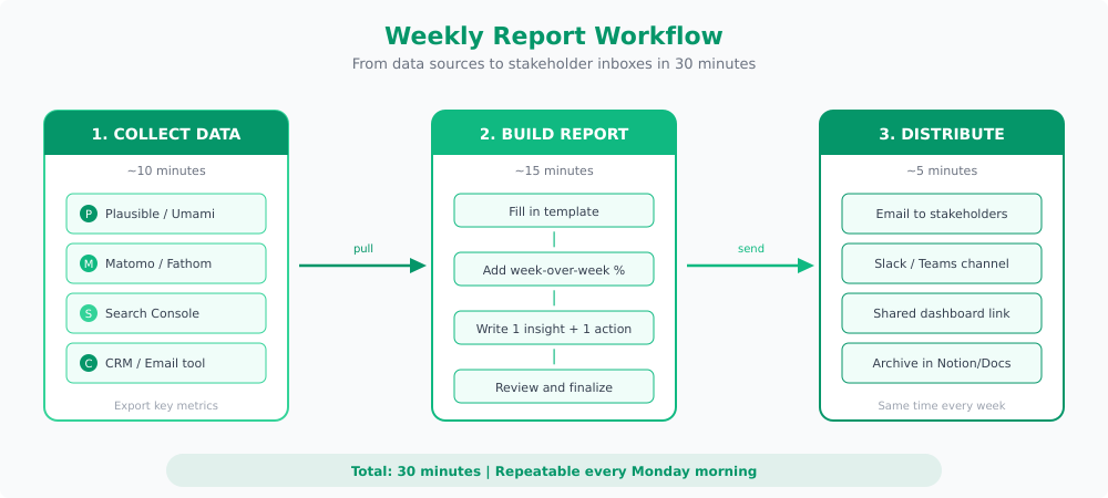
Nobody reads a 20-page marketing report. The best reports I’ve built fit on a single page and take 30 minutes to put together. Here’s the template.
After six years of building weekly marketing reports for clients and internal teams, I’ve learned that the reports people actually read share three things: they’re short, they’re consistent, and they end with a clear next step. Everything else is noise.
This guide walks you through a repeatable weekly marketing report template that covers what matters, skips what doesn’t, and works with any privacy-first analytics tool you’re already using.
Why Weekly Reports Matter
Monthly reports are too slow. Daily reports are too noisy. Weekly is the sweet spot for most marketing teams.
A good weekly report does three things:
- Catches problems early. A traffic drop on Monday is fixable. A traffic drop you notice four weeks later is a mystery.
- Creates accountability. When you commit to one action item each week, things actually get done.
- Builds trust. Stakeholders who see consistent, honest reporting stop asking for ad hoc data pulls. That alone is worth the 30 minutes.
What I’ve learned the hard way is that the format matters more than the depth. A one-page report that gets read beats a 15-page deck that gets ignored every time.
The One-Page Report Template
The template I use with every client has four sections. Each one answers a specific question, and together they tell the full story of your marketing week.
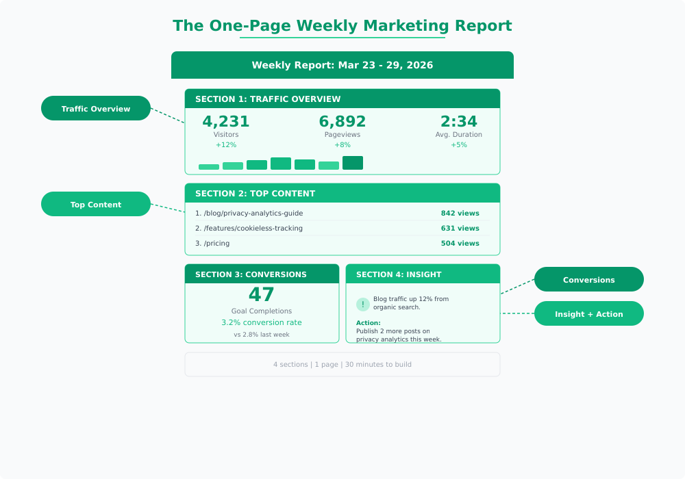
Here’s what goes in each section and how to fill it in quickly.
Section 1: Traffic Overview
This section answers: How many people visited, and is that number going up or down?
Include three metrics, each with a week-over-week comparison:
- Unique visitors — Your headline number. If you only track one thing, track this.
- Pageviews — Shows depth of engagement. A spike in pageviews with flat visitors means your content is pulling people deeper.
- Average visit duration — A rough proxy for content quality. Don’t obsess over it, but watch for sudden drops.
Pull these directly from your analytics dashboard. In Plausible, they’re right on the main screen. In Umami, check the website overview. In Matomo, the visitors overview has everything you need.
The week-over-week percentage is what makes this useful. Raw numbers without context mean nothing. If you had 3,000 visitors this week, is that good? You can’t tell unless you know last week was 2,400 (good) or 4,500 (not good). For a deeper look at what these website traffic metrics actually mean and where they can mislead you, I wrote a full breakdown.
Section 2: Top Content
This section answers: What did people actually look at this week?
List your top 5 pages by pageviews. That’s it. Don’t overcomplicate this.
What you’re looking for:
- New entries. A page that wasn’t in the top 5 last week but is now? Something changed. Maybe a post got shared, maybe a keyword started ranking. Worth investigating.
- Consistent performers. Pages that show up every week are your workhorses. Make sure they have clear calls to action.
- Surprises. An old blog post suddenly getting traffic usually means organic search picked it up. Double down on that topic.
If you want to understand why certain content attracts specific audience segments over time, cohort analysis is the next step. But for the weekly report, the top 5 list is enough.
Section 3: Conversions and Goals
This section answers: Did visitors do the thing we wanted them to do?
Define “the thing” based on your business:
| Business Type | Primary Goal | What to Track |
|---|---|---|
| SaaS | Sign-ups or trial starts | Goal completions + conversion rate |
| E-commerce | Purchases | Transactions + revenue |
| Content / Media | Newsletter sign-ups | Form submissions + growth rate |
| B2B / Services | Contact form or demo requests | Leads + source attribution |
Report two numbers: total goal completions and conversion rate (completions divided by visitors). Always include the week-over-week change.
In most privacy-first tools, you set up goals or custom events to track these. Plausible and Umami both support custom event tracking without cookies, which means your conversion numbers reflect actual behavior rather than modeled data.
Section 4: One Insight, One Action
This is the section that separates useful reports from data dumps. And honestly, it’s the part most people skip — which is exactly why their reports get ignored.
The format is simple:
- One insight: A single observation from this week’s data. Not a list of five things. One thing.
- One action: What you’re going to do about it next week. Be specific enough that you can check whether it happened.
Good example:
Insight: Blog traffic from organic search increased 18% this week, driven by the privacy tools comparison post.
Action: Publish a follow-up post comparing Plausible and Umami pricing by Friday.
Bad example:
Insight: Traffic was up this week.
Action: Continue monitoring.
“Continue monitoring” is not an action. If the data doesn’t suggest a specific next step, look harder or ask a better question.
Tools for Automated Reporting
You don’t need to build this report from scratch every week. Most privacy-first analytics tools have built-in reporting features that do half the work for you.
- Plausible — Has built-in email reports that send weekly traffic summaries automatically. Use these as your starting point and add the insight and action sections manually.
- Umami — Export data through the dashboard or API. Pair it with a simple template in Notion for a clean weekly format.
- Matomo — Scheduled email reports with custom date ranges. The most flexible option if you want to automate the entire report.
- Looker Studio — Connects to multiple data sources and lets you build a live dashboard that updates automatically. Good for teams that prefer a link over an email attachment.
The template I use with most clients is a simple shared document with four sections that stays the same every week. The consistency is the point. When the format never changes, readers know exactly where to look for the information they care about.
Tips for Reports That Get Read
After building these for dozens of teams, here’s what I’ve seen work best:
Send it at the same time every week. Monday morning works for most teams. Pick a time and never miss it. Consistency builds the habit of reading it.
Lead with the headline number. Put the most important metric at the top. If your stakeholder only reads one line, make it the one that matters.
Use comparisons, not absolutes. “2,400 visitors” means nothing in isolation. “2,400 visitors, up 15% from last week” tells a story.
Keep it to one page. If you can’t fit your weekly update on one page or one screen, you’re including too much. Move the detailed breakdowns to an appendix or a linked dashboard.
Write for the least technical person in the room. If your CEO can’t understand the report without asking follow-up questions, simplify it. The best reports need zero explanation.
End with the action item. The action item is why the report exists. Everything else is context for that one decision.
The whole point of a weekly marketing report isn’t to prove you’re busy. It’s to make one better decision each week. Stack those up over a quarter and you’ll have made 12 deliberate improvements instead of reacting to whatever felt urgent. That’s how good marketing compounds.
Jonathan Whitaker
Marketing analyst and CXL-certified optimizer with 6+ years of experience in web analytics, conversion optimization, and privacy-first data strategy. Former analytics lead for e-commerce and SaaS companies across North America, now focused on helping businesses make better decisions with less data. Specializes in Plausible, Umami, Matomo, and cookieless analytics. Based in Vancouver, BC.