
You launched a new feature last month. Signups went up. But are those new users actually sticking around, or are they churning faster than your old users did?
This is exactly the kind of question cohort analysis answers. Instead of looking at all your users as one blob, you group them by when they joined (or what they did), and then watch how each group behaves over time.
In this guide, I’ll show you how to do cohort analysis step by step—using practical examples and privacy-friendly tools. No data science degree required.
What is cohort analysis?
A cohort is simply a group of users who share something in common—usually the time they first appeared or a specific action they took.
For example:
- Everyone who signed up in January = January cohort
- Everyone who came from a Facebook campaign = Facebook cohort
- Everyone who completed onboarding = Onboarded cohort
Cohort analysis means tracking how each of these groups behaves over time. You’re not asking “what’s our overall retention rate?”—you’re asking “how does January’s retention compare to February’s?”
This shift from aggregate metrics to cohort-based metrics is what separates surface-level analytics from actionable insights.
Why cohort analysis matters
Here’s the problem with looking at overall metrics: they hide trends.
Imagine your app shows 40% monthly retention. Sounds stable, right? But what if:
- Users from 6 months ago retain at 60%
- Users from last month retain at only 20%
That 40% average is masking a serious problem: your recent cohorts are churning much faster. Something changed—maybe your onboarding broke, maybe you’re attracting the wrong audience, maybe a competitor launched.
Without cohort analysis, you’d never see this. You’d think everything was fine while your business slowly erodes.
Cohort analysis helps you:
- Spot trends early — See if retention is improving or declining before it hits your bottom line
- Measure the impact of changes — Did that new onboarding flow actually improve retention for new users?
- Compare acquisition channels — Which source brings users that stick around?
- Find your best customers — What do high-retention cohorts have in common?
Types of cohorts you can analyze
Before we get into the how-to, let’s cover the main types of cohorts. The one you choose depends on the question you’re trying to answer.
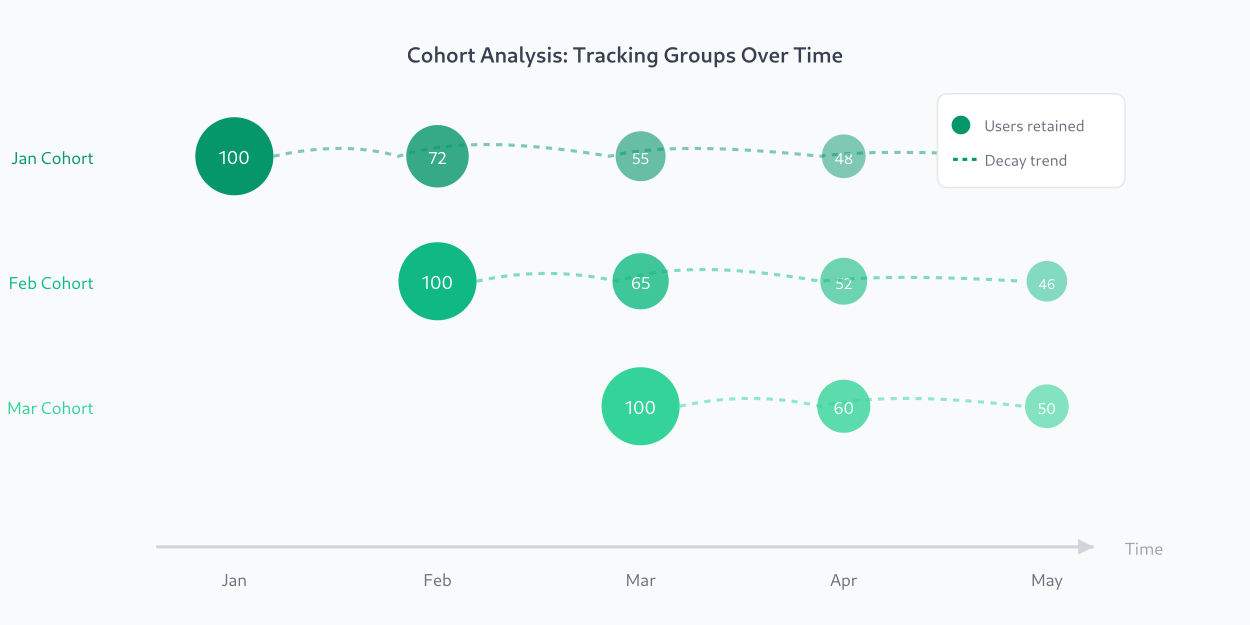
Time-based cohorts (most common)
Group users by when they first showed up:
- Weekly cohorts: Users who signed up in Week 1, Week 2, Week 3…
- Monthly cohorts: Users who signed up in January, February, March…
Use this to answer: “Is our retention getting better or worse over time?”
Acquisition cohorts
Group users by how they found you:
- Organic search cohort
- Paid ads cohort
- Referral cohort
- Email campaign cohort
Use this to answer: “Which channels bring users who actually stick around?”
Behavioral cohorts
Group users by actions they took:
- Users who completed onboarding vs. those who skipped
- Users who used feature X in their first week
- Users who invited a teammate
Use this to answer: “What actions correlate with long-term retention?”
How to do cohort analysis: step by step
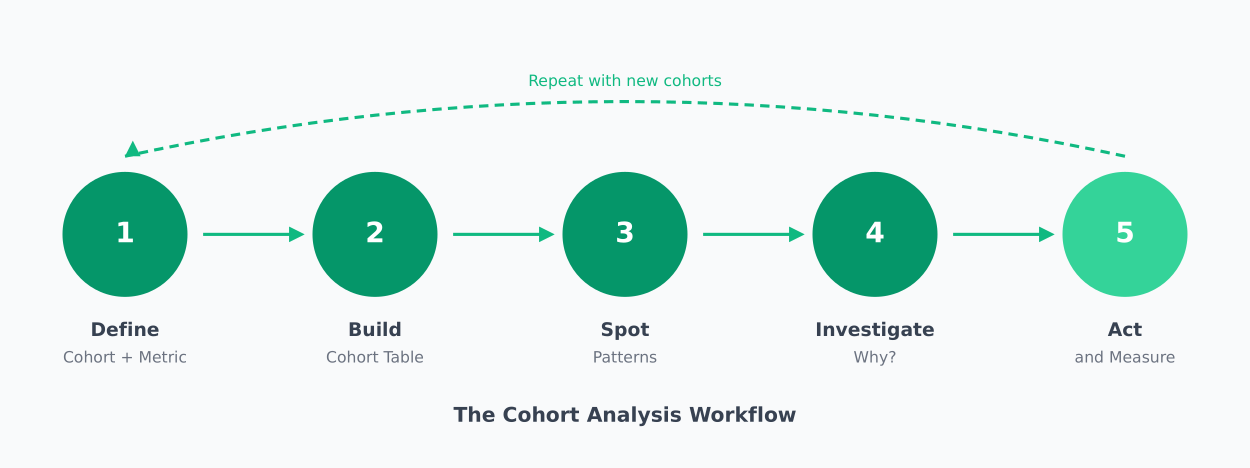
Now let’s get practical. Here’s how to actually run a cohort analysis, whether you’re using a dedicated tool or building it yourself.
Step 1: Define your cohort and metric
Start by answering two questions:
- How will you group users? (signup date, acquisition channel, first action)
- What metric will you track? (return visits, purchases, feature usage)
For most businesses, the classic starting point is:
- Cohort: Monthly signup cohorts
- Metric: Retention (% of users who return in each subsequent period)
Let’s use this example throughout the guide.
Step 2: Set your time periods
Decide on two timeframes:
- Cohort period: How you group users (weekly or monthly is most common)
- Measurement periods: How long you’ll track each cohort (Week 1, Week 2… or Month 1, Month 2…)
For a SaaS product, monthly cohorts with 6-12 months of measurement periods works well. For a high-frequency app (social, gaming), weekly cohorts with 8-12 weeks might be better.
The key is consistency—once you pick a cadence, stick with it so you can compare cohorts fairly.
Step 3: Build your cohort table
A cohort table (also called a retention table or cohort matrix) is the foundation of cohort analysis. Here’s what it looks like:
| Cohort | Users | Month 0 | Month 1 | Month 2 | Month 3 |
|---|---|---|---|---|---|
| Jan 2025 | 1,000 | 100% | 45% | 32% | 28% |
| Feb 2025 | 1,200 | 100% | 42% | 30% | — |
| Mar 2025 | 1,500 | 100% | 38% | — | — |
| Apr 2025 | 1,800 | 100% | — | — | — |
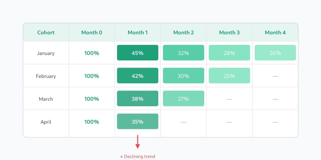
Reading this table:
- Rows = cohorts (when users joined)
- Columns = time since joining
- Cells = % of users still active in that period
- Month 0 = the signup month itself (always 100%)
Notice the diagonal pattern of missing data—newer cohorts haven’t existed long enough to have Month 2 or Month 3 data yet.
Step 4: Spot the patterns
Now analyze your table. Look for:
Vertical patterns (same column): Compare Month 1 retention across cohorts. In the example above:
- January: 45%
- February: 42%
- March: 38%
That’s a downward trend—Month 1 retention is getting worse with each cohort. Something changed.
Horizontal patterns (same row): See how fast each cohort decays. The January cohort went 100% → 45% → 32% → 28%. That’s a typical decay curve—steep drop in Month 1, then stabilizing.
Diagonal patterns: Look at the same calendar month across cohorts. If March had a site outage, you’d see it affect multiple cohorts at that point in their lifecycle.
Step 5: Investigate anomalies
When you spot a pattern, dig deeper:
- Retention dropped for March cohort? Check what changed—new signup flow? Different ad targeting? Seasonal traffic?
- One cohort retained much better? Look at what’s different—source, geography, device, behavior in first session.
- All cohorts drop sharply at Week 2? Maybe your trial expires then and you need better upgrade prompts.
This investigation is where the real value lives. The table shows you what happened; your job is to figure out why.
Step 6: Take action and measure again
Based on your findings, make changes:
- Fix a broken onboarding flow
- Shift budget to better-performing channels
- Add engagement triggers at high-churn points
- Test different messaging for different cohorts
Then watch the next cohorts. Did their retention improve? That’s how you close the loop and turn analysis into results.
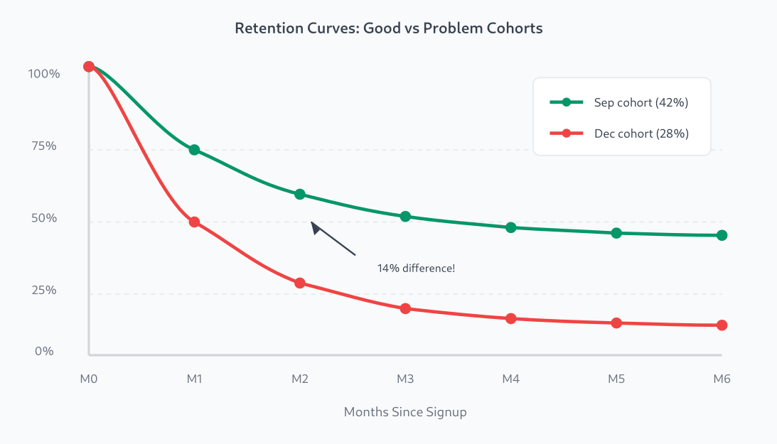
Cohort analysis example: finding a retention problem
Let me walk through a realistic example from my own experience.
A SaaS client noticed their overall 30-day retention was stuck at 35%. Not terrible, but not growing. They asked me to figure out what was happening.
I built a cohort table for the last 6 months. Here’s what I found:
| Cohort | Users | Day 7 | Day 14 | Day 30 |
|---|---|---|---|---|
| Sep 2024 | 800 | 58% | 48% | 42% |
| Oct 2024 | 950 | 55% | 45% | 38% |
| Nov 2024 | 1,100 | 52% | 40% | 33% |
| Dec 2024 | 1,400 | 48% | 35% | 28% |
The pattern was clear: retention was dropping with each cohort, even as user count grew. The 35% overall average was being propped up by older, stickier users.
We investigated and found the culprit: in October, they’d started running aggressive Facebook ads that brought lots of signups but poor-fit users. The December cohort (mostly from ads) retained at only 28%, while organic users from the same period retained at 45%.
The fix: tighten ad targeting and add a qualification step to the signup flow. Within two months, new cohort retention climbed back to 40%+.
Without cohort analysis, they would have kept pouring money into ads that were actively hurting their business.
Tools for cohort analysis
You can do cohort analysis in a spreadsheet if you have raw event data. But purpose-built tools make it much easier.
Here are privacy-friendly options that won’t require you to hand user data to Google:
Matomo
Best for: Teams who want full data ownership
Matomo has a built-in Cohorts report that lets you analyze retention by signup date. You can self-host it for complete data control, or use their cloud version.
- Pros: Self-hosted option, GDPR-compliant, no data sampling
- Cons: Cohort analysis requires the premium plugin on self-hosted
- Pricing: Free (self-hosted basic), $19+/mo (cloud)
PostHog
Best for: Product teams who want cohorts + feature flags + session replay
PostHog is an open-source product analytics suite with excellent cohort analysis. Their retention charts are flexible and you can segment by any property.
- Pros: Open-source, self-hostable, powerful retention analysis
- Cons: More complex setup than simpler tools
- Pricing: Free tier generous, paid starts at $0 (usage-based)
Mixpanel
Best for: Teams focused on product analytics and user journeys
Mixpanel pioneered event-based analytics and has robust cohort analysis with customizable retention charts. Not self-hostable, but offers EU data residency.
- Pros: Excellent UI, powerful segmentation, flexible retention charts
- Cons: Cloud-only, can get expensive at scale
- Pricing: Free up to 20M events/mo, paid plans from $24/mo
Amplitude
Best for: Enterprise teams needing advanced behavioral analysis
Amplitude is a full product analytics platform with sophisticated cohort analysis, including behavioral cohorts and predictive analytics.
- Pros: Very powerful, great for complex analysis, good collaboration features
- Cons: Learning curve, expensive at scale
- Pricing: Free tier available, paid plans from $49/mo
DIY with SQL + spreadsheet
Best for: Teams with data warehouse access who want full control
If you have your events in a database, you can build cohort analysis with SQL. The basic query groups users by signup date and counts how many were active in each subsequent period.
This approach is more work but gives you complete flexibility. I’ll often prototype in SQL before deciding if a dedicated tool is worth it.
Common mistakes to avoid
After doing cohort analysis for years, here are the pitfalls I see most often:
1. Cohorts that are too small
If your weekly cohort has only 50 users, a few random churns will swing your retention rate wildly. Use larger time windows or combine cohorts until you have statistically meaningful sample sizes.
2. Comparing apples to oranges
A January cohort includes holiday signups. A September cohort might be mostly back-to-school traffic. Be aware of seasonality and external factors when comparing across time.
3. Only looking at retention
Retention is the most common metric, but cohort analysis works for anything: revenue per user, feature adoption, support tickets, NPS scores. Pick the metric that matters most for your current goal.
4. Analysis without action
A beautiful cohort chart that sits in a dashboard helps no one. Every analysis should lead to a hypothesis and an action. “March cohort dropped—let’s investigate and fix it” beats “interesting pattern” every time.
Related reading
Summary
Cohort analysis is one of the most powerful tools in your analytics toolkit. It turns vague questions like “how’s retention?” into specific, actionable insights like “March cohort retention dropped 15% because of our new signup flow.”
Here’s what to remember:
- Group users by when they joined (or by channel, or by behavior)
- Track a metric over time for each group
- Look for patterns — especially declining trends in newer cohorts
- Investigate anomalies — the “why” matters more than the “what”
- Take action — then measure the next cohorts to see if it worked
Start simple. Build a monthly retention cohort table. See what it tells you. That first insight—when you spot a trend that was invisible in your aggregate metrics—is when cohort analysis clicks.
Jonathan Whitaker
Marketing analyst and CXL-certified optimizer with 6+ years of experience in web analytics, conversion optimization, and privacy-first data strategy. Former analytics lead for e-commerce and SaaS companies across North America, now focused on helping businesses make better decisions with less data. Specializes in Plausible, Umami, Matomo, and cookieless analytics. Based in Vancouver, BC.