You’re getting traffic. People visit your site, look around, and leave. The analytics dashboard shows pageviews going up, but revenue stays flat.
This is where conversion rate optimisation (CRO) comes in. Instead of chasing more traffic, you focus on getting more value from the visitors you already have.
In this guide, I’ll share the CRO practices that actually move the needle—based on what I’ve seen work across dozens of projects. No fluff, no generic advice. Just practical tactics you can implement this week.
What is conversion rate optimisation?
Conversion rate optimisation is the practice of increasing the percentage of visitors who complete a desired action on your website.
That action could be:
- Making a purchase
- Signing up for a free trial
- Subscribing to a newsletter
- Requesting a demo
- Downloading a resource
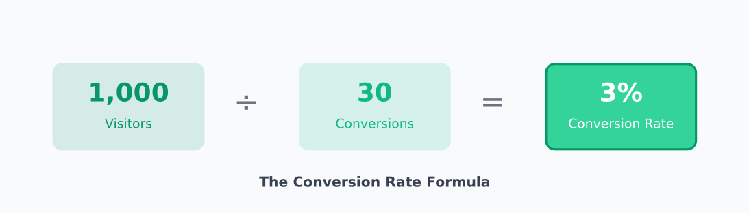
The formula is simple:
Conversion Rate = (Conversions ÷ Total Visitors) × 100
If 1,000 people visit your pricing page and 30 sign up, your conversion rate is 3%.
The goal of CRO is to move that number up—without spending more on ads or content. You’re optimising the visitors you already have.
Why CRO matters more than ever
Traffic is expensive. Whether you’re paying for ads or investing in SEO, every visitor costs something to acquire.
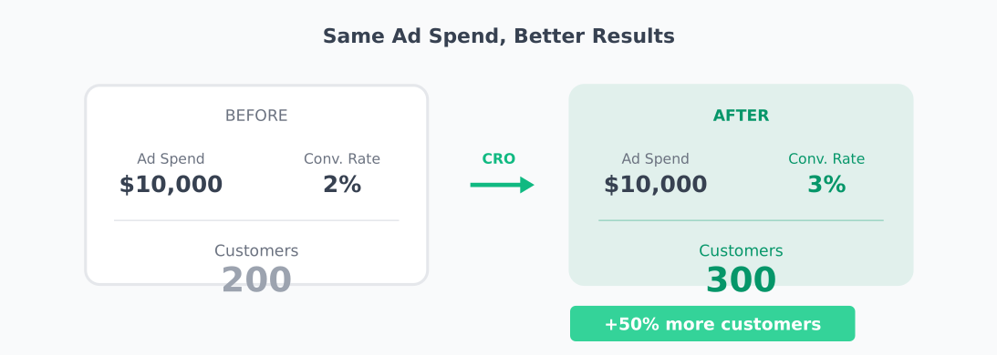
Here’s the math that makes CRO compelling:
- If you spend $10,000/month on ads and convert at 2%, you get 200 customers
- Improve conversion to 3%, and you get 300 customers—same ad spend
- That’s 50% more revenue without increasing your budget
CRO compounds. A small improvement today keeps paying off with every future visitor.
12 CRO best practices that actually work
Let’s get into the tactics. I’ve organised these from foundational (start here) to advanced (once you have the basics).
1. Define one clear goal per page
Every page should have a primary action you want visitors to take. Not three actions. One.
When you give people too many choices, they choose nothing. This is called the paradox of choice—more options lead to decision paralysis.
How to apply this:
- Homepage → Get them to the product or pricing page
- Pricing page → Start a trial or purchase
- Blog post → Subscribe or read related content
- Landing page → One CTA, one goal, no navigation
Audit your pages. If you have multiple CTAs competing for attention, pick the one that matters most and de-emphasise the rest.
2. Write headlines that speak to the problem
Your headline is the first thing visitors see. If it doesn’t resonate, they leave.
The most effective headlines focus on the problem your visitor has, not the features you offer.
Weak: “Advanced Analytics Platform with Real-Time Dashboards”
Better: “See What’s Actually Happening on Your Website”
Weak: “AI-Powered Email Marketing Software”
Better: “Send Emails People Actually Open”
Test your headlines. In my experience, headline changes can move conversion rates by 10-30%. It’s often the highest-impact test you can run.
3. Make your CTA impossible to miss
Your call-to-action button should be the most visually prominent element on the page.
CTA best practices:
- Contrast: Use a colour that stands out from your palette
- Size: Big enough to tap easily on mobile (minimum 44×44 pixels)
- Position: Above the fold and repeated after key sections
- Text: Action-oriented and specific (“Start Free Trial” beats “Submit”)
Personalised CTAs perform significantly better than generic ones. If you can show “Continue Your Free Trial” to returning visitors instead of “Start Free Trial,” do it.
4. Reduce friction in your forms
Every field in your form is a reason for someone to abandon. Only ask for what you absolutely need.
Common friction points:
- Asking for phone number when email is enough
- Requiring account creation before purchase
- Splitting forms across multiple pages unnecessarily
- Confusing validation errors
Quick wins:
- Remove optional fields entirely (or make them truly optional)
- Use inline validation so errors appear immediately
- Enable autofill and auto-detect (country, card type)
- Show progress indicators for multi-step forms
I’ve seen forms go from 8 fields to 3, with conversion rates doubling. Less is almost always more.
5. Build trust with social proof
People look to others when making decisions. Social proof reduces perceived risk and builds confidence.
Types of social proof that work:
- Customer logos: “Trusted by teams at Stripe, Shopify, and Notion”
- Testimonials: Real quotes with names, photos, and titles
- Case studies: Specific results (“Increased conversions by 34%”)
- Review scores: G2, Capterra, Trustpilot ratings
- User counts: “Join 50,000+ marketers”
Place social proof near decision points—next to pricing, above CTAs, on checkout pages. That’s when visitors need reassurance most.
6. Fix your page speed
Slow pages kill conversions. Studies consistently show that pages loading in 1 second convert 2-3x better than pages loading in 5 seconds.
Every additional second of load time increases bounce rate and decreases conversion.
Quick speed fixes:
- Compress and properly size images
- Enable browser caching
- Minify CSS and JavaScript
- Use a CDN for static assets
- Lazy-load images below the fold
Test your speed with Google PageSpeed Insights or WebPageTest. Aim for under 3 seconds on mobile.
7. Optimise for mobile first
More than half of web traffic is mobile. If your site isn’t optimised for phones, you’re losing conversions.
Mobile CRO checklist:
- Buttons are large enough to tap (44×44px minimum)
- Forms use appropriate input types (email, tel, number)
- Text is readable without zooming (16px minimum)
- CTAs are visible without scrolling
- No horizontal scrolling required
- Pop-ups don’t block the entire screen
Always test your conversion flow on a real phone, not just browser dev tools. The experience is different.
8. Use heatmaps to find problems
Heatmaps show you where visitors click, scroll, and spend time. They reveal problems that analytics alone can’t show.
What to look for:
- Dead clicks: People clicking on non-clickable elements (they expect a link)
- Scroll depth: How far down the page do people actually go?
- Ignored CTAs: Buttons that get no attention
- Rage clicks: Repeated clicking in frustration
Privacy-friendly heatmap tools include PostHog (open-source) and Matomo (self-hosted option).
9. Run A/B tests (properly)
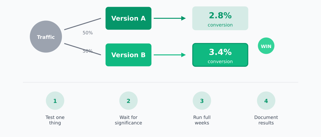
A/B testing is the gold standard for CRO. You show different versions to different visitors and measure which performs better.
A/B testing fundamentals:
- Test one thing at a time: If you change the headline AND button colour, you won’t know which made the difference
- Wait for statistical significance: Don’t call a winner after 50 visitors. Use a sample size calculator
- Run tests for full weeks: Behaviour varies by day, so test in complete weekly cycles
- Document everything: Record your hypothesis, what you tested, and results
How long should you run a test?
It depends on your traffic and baseline conversion rate. As a rough guide:
- High-traffic site (10,000+ daily visitors): 1-2 weeks
- Medium traffic (1,000-10,000 daily): 2-4 weeks
- Low traffic (under 1,000 daily): Consider qualitative research instead
10. Address objections directly
Visitors have doubts. Your job is to answer them before they leave.
Common objections and how to address them:
- “Is it worth the price?” → Show ROI, case studies, money-back guarantee
- “Will it work for me?” → Testimonials from similar customers, free trial
- “Is it safe?” → Security badges, privacy policy, trust seals
- “What if I need help?” → Visible support options, response time promises
- “Can I cancel easily?” → Clear cancellation policy, no long-term contracts
Put objection-handling content near your CTAs. An FAQ section on the pricing page often lifts conversions.
11. Simplify navigation
Complex navigation confuses visitors. If they can’t find what they’re looking for in a few seconds, they leave.
Navigation best practices:
- Limit top-level items to 5-7 maximum
- Use clear, descriptive labels (not clever marketing speak)
- Make the most important pages easiest to find
- Include a visible search for content-heavy sites
- On landing pages, consider removing navigation entirely
Watch session recordings to see where people get lost. You’ll be surprised how often “obvious” navigation isn’t obvious at all.
12. Learn from failed tests
Here’s something most CRO guides don’t tell you: most tests fail. Industry data suggests only 10-30% of A/B tests produce a winning variant.
That’s okay. Failed tests are valuable too.
When a test doesn’t win:
- You learned what doesn’t matter to your audience
- You avoided making a permanent change that wouldn’t help
- You can form a new hypothesis based on the data
Document failed tests just as carefully as winners. The pattern of what doesn’t work often reveals what will.
CRO tools for privacy-conscious teams
You don’t need to sacrifice user privacy for conversion insights. Here are tools that work without invasive tracking:
Analytics:
- Plausible — Lightweight, privacy-first analytics
- Umami — Open-source, self-hostable
- Matomo — Full-featured with self-hosting option
Heatmaps & Session Recording:
A/B Testing:
- PostHog — Feature flags and experiments
- GrowthBook — Open-source experimentation platform
Where to start
CRO can feel overwhelming. Here’s a simple starting point:
- Pick your highest-traffic page that’s underperforming
- Identify the one action you want visitors to take
- Look for obvious friction — confusing copy, weak CTA, slow load time
- Make one change and measure the result
- Repeat
You don’t need a complex testing program to start. Pick the lowest-hanging fruit, fix it, and build from there.
Small improvements compound. A 10% lift this month, another 10% next month—that’s how you transform your conversion rate over time.